Education Unlimited
Education Unlimited is a mathematics consultancy providing tutoring, teacher training and research services for students and schools across the UK and beyond. Their holistic approach to teaching gives students the confidence to achieve their goals.
Scope of work
-
As with all of my branding projects, this project kicked off with a brand strategy workshop where we discussed and gained clarity on Education Unlimited’s purpose, personality and positioning in preparation for developing the visual identity.
The key outcome of this workshop was that Education Unlimted take a holistic and empowering approach to tutoring and believe that building confidence in both students and teachers leads to more success and opportunities in their future lives. -
After clarifying the purpose, personality and positioning and agreeing the key idea to get across is around building confidence and creating opportunities, we began to develop concepts for Education Unlimited’s visual identity.
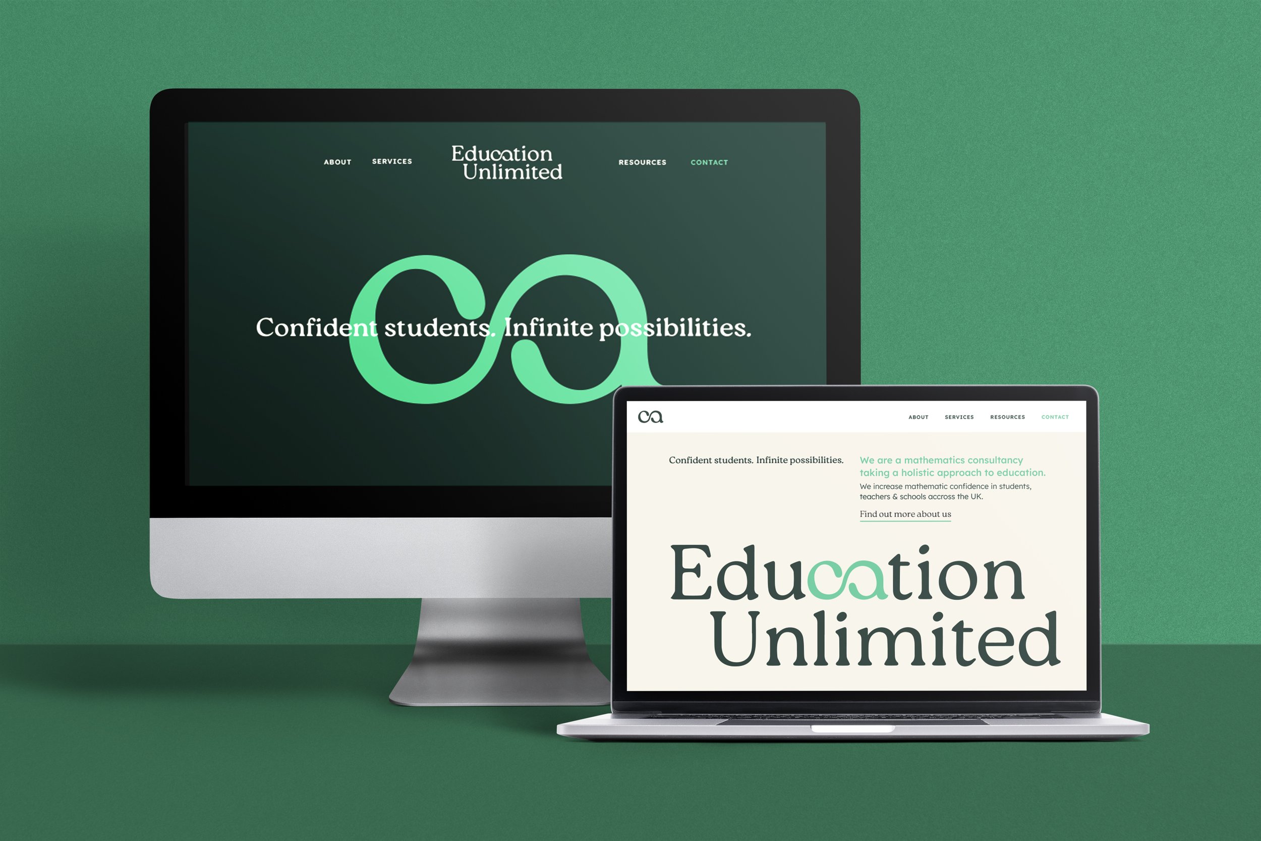
Taking the idea of building confidence and pairing it with the very appropriate name: Education Unlimited, the chosen solution was to emphasise the idea of ‘unlimited opportunities’ through crafting a smart and sophisticated logotype containing an infinity symbol to represent the brand idea.
The infinity mark can also be used individually outside of the full logo and becomes a quick and memorable shorthand for the brand, such as for their social media presence.The colour palette and fonts all work together to help to attract a slightly higher-end client and communicate the high level of knowledge and expertise behind the business - as the founder is an ex-Oxford University lecturer and a Doctor of Mathematics.
-
To start to bring this brand to life, we developed some designs for business stationery such as business cards & letterheads as well as notebooks and a tote bag.
To carry through the sense of sincerity and expertise, print quality had to remain exceptional, using only the best paper stock, and considering effects such as embossing and spot-UV to elevate the design further. -
The final and crucial element of this rebrand was to develop concepts for how the identity could be applied to Education Unlimited’s website which included an audit of their current website and several concepts for how the landing page could look and feel, in line with their new brand identity and messaging.


